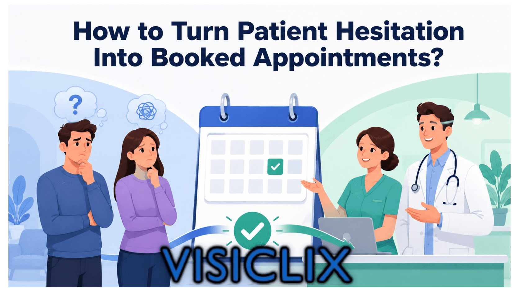
Getting someone to click is not the hard part. Getting that person to trust your practice enough to book an eye exam, request a consultation, or call now is where most eye care landing pages fall apart.
That usually happens because the copy is doing the wrong job. It talks about the practice instead of the patient’s concern. It sounds broad when the search was specific. It asks for commitment before it builds confidence. For PPC campaigns, that disconnect matters even more because Google evaluates landing page experience based in part on relevance, usefulness, and how well the page matches what the user expected after clicking.
For eye care, good landing page copy has to do several things at once. It must reassure a worried patient, explain the service clearly, reduce friction around insurance or scheduling, and make the next step feel easy. It also needs to be readable for people who may already be dealing with blurred vision, eye discomfort, aging-related vision changes, or medical uncertainty. EyeSmart and NEI both emphasize how important trustworthy, medically accurate eye-health information is for patients, while HHS, CDC, and W3C all reinforce the value of plain language and accessible web content.
What is landing page copywriting for eye care?
Landing page copywriting for eye care is the process of writing a focused page that turns a visitor into a patient inquiry or appointment. Unlike a general website page, a landing page is built around one main action and one main intent. In practice, that means the copy should align closely with the search, explain the service in plain language, show why the practice is credible, and make the next step obvious. That approach fits both conversion best practice and Google Ads guidance around relevance and landing page usefulness.
In eye care, that copywriting job is especially sensitive because patients are often comparing providers while trying to understand symptoms, urgency, costs, or treatment options. NEI notes that many eye diseases may not show symptoms early, and AAO’s public education resources are built around giving patients reliable, understandable information they can act on. That means an effective eye care landing page cannot just be promotional. It has to educate enough to reduce uncertainty.
Why do eye care landing pages often get clicks but fail to convert?
Most eye care landing pages fail because they do not match the visitor’s actual intent closely enough. Someone searching for “dry eye treatment near me” does not want a generic page about the practice. Someone searching for “cataract consultation” does not want the same headline and CTA used for routine eye exams. Google explicitly ties landing page experience to the usefulness and relevance of the information on the page and to the expectations created by the ad. When those pieces do not line up, conversion usually drops.
The other common issue is friction. Patients hesitate when they cannot tell whether a page is about the right service, whether the doctor is qualified, whether insurance is accepted, how quickly they can be seen, or what happens after they submit a form. In healthcare more broadly, AHRQ highlights the importance of patient preferences around communication, appointments, and decision-making. Good landing page copy reduces uncertainty around exactly those issues.
How should eye care businesses match landing page copy to search intent?
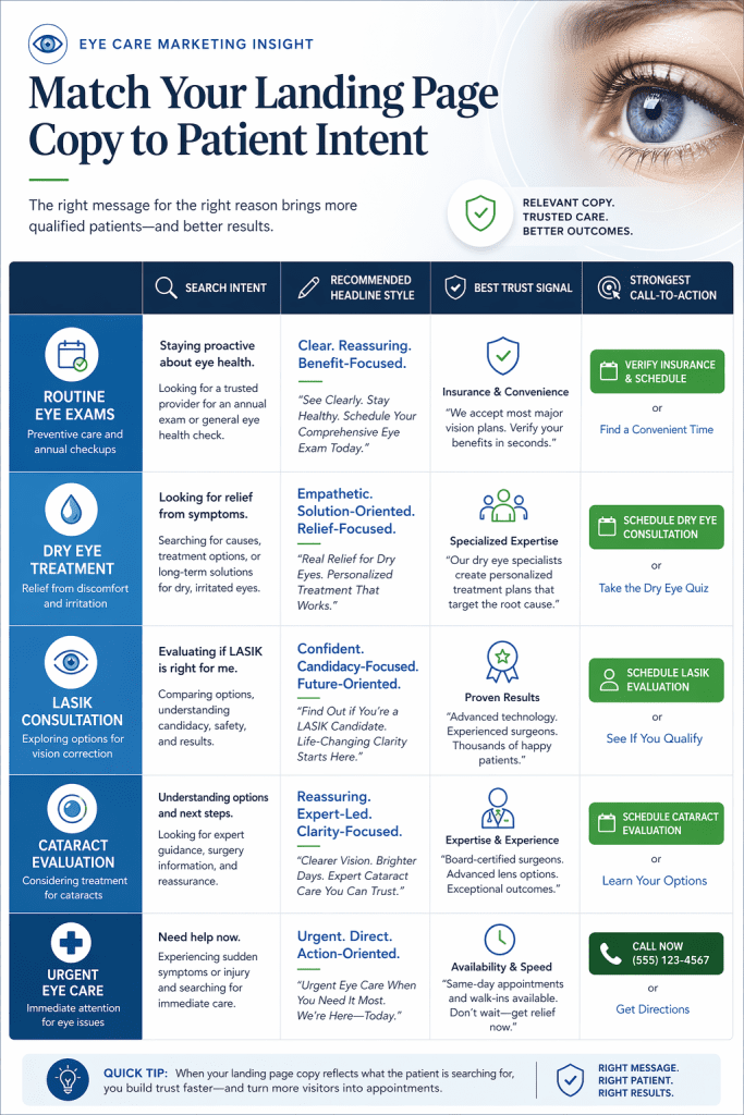
The first rule is simple: write the page for the reason the person searched. Search intent in eye care usually falls into a few clear groups, including routine care, symptoms, procedures, urgent care, and cost or insurance questions. A landing page converts better when its headline, proof points, and CTA reflect that exact intent rather than trying to serve every audience at once. Google’s own ad quality guidance supports this by recommending that ad language match search intent more directly and that keywords with different intent be split into tighter groups.
For routine care, the copy should emphasize convenience, accepted insurance, location, and ease of booking. For symptom-based searches such as flashes, irritation, or blurred vision, the page should lead with clarity about what the practice evaluates and whether same-day care is available. For treatment pages like LASIK or cataracts, the copy should do more trust-building because the decision is usually higher stakes and less immediate. For urgent eye care, the page should be direct, highly visible, and action-oriented. NEI’s eye condition resources and EyeSmart’s patient education model both support the idea that people need understandable, condition-specific information to move forward confidently.
What should the headline and hero section say on an eye care landing page?
The hero section should answer the visitor’s silent first question: “Am I in the right place?” That means the headline should confirm the service, the subheadline should reduce uncertainty, and the CTA should explain the next step. This is not just a writing preference. It directly supports message match, relevance, and the user’s expected post-click experience.
A strong eye care headline usually follows one of these patterns: identify the service clearly, identify the problem clearly, or identify the next step clearly. For example, “Schedule a Comprehensive Eye Exam With a Local Vision Team,” “Relief Starts Here for Dry, Irritated Eyes,” or “Request Your Cataract Consultation Today.” The subheadline should then answer the next practical concern, such as whether insurance is accepted, whether consultations are available, or whether same-day appointments may be possible.
The CTA should be specific. “Book Your Eye Exam,” “Request a LASIK Consultation,” “Call for Urgent Eye Care,” and “Verify Insurance” are all stronger than “Submit” because they tell the user what will happen. In healthcare contexts, plain language improves comprehension, and W3C guidance also recommends writing that is clear and easy to understand for users with disabilities.
How much information should eye care landing page copy include?
Eye care landing pages should be concise, but they should not be thin. A short page can work for a low-friction service like a routine eye exam, but many eye care decisions require more reassurance before a patient acts. The right amount of information is whatever helps the patient understand the service, trust the provider, and feel comfortable with the next step. Because Google evaluates landing pages partly on usefulness and relevance, removing too much substance can hurt both conversion quality and landing page experience.
The practical structure is to keep the top of the page simple and decision-focused, then add more detail lower down. Above the fold, the visitor should see the service, the benefit, the CTA, and a quick trust cue. Below that, the page can answer common questions, explain candidacy or next steps, and clarify insurance, scheduling, and credentials. This supports both patient understanding and plain-language health communication best practices.
What trust signals help eye care landing page copy convert more patients?
Trust signals matter more in eye care than in many other local service categories because the perceived risk is higher. Patients are making decisions about sight, comfort, medical evaluation, surgery, long-term care, or their child’s vision. That is why the most effective proof points are not vague claims like “high-quality care.” The stronger signals are doctor credentials, specialty areas, years of experience, treatment-specific expertise, affiliations, technology used, verified patient feedback, insurance information, and a clearly presented practice location and phone number. AAO’s public-facing education efforts are built around trusted, physician-reviewed information, which reflects how much authority matters in this category.
These signals work best when they are written naturally into the copy. Instead of adding a random badge strip, say something like: “Meet with an experienced cataract team that evaluates your vision needs, explains your options clearly, and guides you through the next step.” That kind of copy blends reassurance, expertise, and patient-centered value. AHRQ’s work on patient preferences and patient-centered decision-making supports this broader principle that patients respond better when information is framed around their needs and decisions, not just provider features.
How should eye care landing page copy handle pricing, insurance, and affordability questions?
Landing pages lose conversions when they avoid cost questions entirely. Patients may not always expect a full fee schedule, but they do want guidance. In eye care, that often means knowing whether insurance is accepted, whether financing exists for procedures, whether a consultation fee applies, or whether the office can provide a good-faith estimate for self-pay care. CMS states that under the No Surprises Act, uninsured or self-pay patients can receive a good-faith estimate of expected charges for scheduled care or upon request.
That makes landing page copy more effective when it replaces vague wording with clearer language. “We accept most insurance” is weak because it leaves the patient with more work. Stronger copy would say: “Our team can help you verify vision or medical insurance benefits before your visit,” or “If you are uninsured or paying out of pocket, ask us about a good-faith estimate before your appointment.” That phrasing is clearer, more compliant with what patients are actually allowed to request, and more reassuring.
For procedure pages such as LASIK or cataracts, affordability language should reduce anxiety without making promises the practice cannot keep. Mention financing only when it exists, and explain it briefly in practical terms. The copy should answer, not dodge, the affordability question.
What call-to-action copy works best for different eye care services?
The best CTA is the one that fits the service and the level of urgency. A routine eye exam page usually performs well with “Book Your Eye Exam” or “Schedule an Appointment.” A cataract or LASIK page usually needs a softer but still direct CTA such as “Request a Consultation” or “See If You’re a Candidate.” An urgent care page should use stronger language such as “Call Now for Same-Day Eye Care” when that is truly available. Matching the CTA to user intent supports both relevance and expected landing page experience.
This matters because commitment level differs by service. A patient booking a standard exam is ready for a direct appointment CTA. A patient researching surgery may want a consultation first. A parent looking for pediatric eye care may need reassurance and insurance clarity before scheduling. The CTA should reflect where the visitor is in the decision process, not just what the practice wants them to do.
How can eye care practices reduce friction in forms and appointment requests?
A conversion form should ask only for the information needed to move the patient to the next step. Every extra field adds hesitation. For most eye care landing pages, name, contact method, and a simple visit reason are enough for an initial inquiry. If the page asks for too much too early, it makes the action feel more complicated than it should. That is especially risky in healthcare, where patients may already be uncertain or stressed.
The copy around the form is just as important as the fields themselves. Tell people when they will hear back, whether someone will call or text, and what the next step is. AHRQ notes that communication and appointment preferences shape how patients interact with healthcare systems, so giving clear options such as phone, form, or scheduling request can improve the experience.
A good example is: “Complete this form and our team will contact you within one business day to help schedule your visit.” That line lowers uncertainty. It also turns the form from a blind submission into a predictable next step.
How should landing page copy change for PPC campaigns in eye care?
PPC landing pages need tighter copy than general website pages because they are judged immediately against the promise of the ad and the search term. Google Ads explains that landing page experience is tied to the usefulness and relevance of the page and to user expectations after clicking the ad. That means eye care PPC pages should repeat the search intent clearly in the headline, avoid mixed messaging, and focus on one conversion goal.
For example, if the keyword is about dry eye treatment, the landing page should not lead with a general practice headline. If the ad mentions insurance verification, the page should mention insurance near the top. If the campaign is for emergency eye care, the page should not bury the phone number below generic paragraphs. Strong PPC copy is not about being clever. It is about being unmistakably relevant.
This is also where service-line segmentation matters. Different ad groups should usually send traffic to different pages or page variants, especially when intent differs. Google’s own guidance about grouping keywords by theme and aligning ad language more directly with search terms supports that approach.
What are the best landing page copy examples for different eye care services?
For a comprehensive eye exam page, the copy should emphasize convenience, prevention, insurance, and ease of booking. A headline such as “Schedule Your Comprehensive Eye Exam” works because it is clear and direct. Supporting copy can mention annual vision checks, prescription updates, and help with ongoing eye health.
For dry eye treatment, the copy should lead with the problem and relief. A stronger opening might be, “Find Relief From Burning, Gritty, or Watery Eyes.” NEI’s eye-health resources show that patients often search around symptoms and conditions, so symptom-led copy is often a better match here than brand-led copy.
For cataract consultations, the page should balance reassurance and expertise. Patients need to know what the consultation covers, who they will meet, and what happens next. Since cataracts are associated with aging and can affect everyday activities, the copy should be empathetic, readable, and calm. NEI specifically describes cataracts as a common part of aging that can blur vision and interfere with daily life.
For urgent eye care, the page should prioritize visibility and action. The phone number, hours, and emergency guidance should be immediate. The copy should make clear what kinds of urgent issues the practice evaluates and whether same-day care may be available.
Which copy mistakes should eye care practices avoid on landing pages?
The biggest mistake is writing the page like a brochure. Patients do not arrive on a landing page asking for a company overview. They arrive with a problem, a question, or a task. Good conversion copy starts there. It names the need, explains the solution clearly, and keeps the path forward simple.
Another mistake is relying on generic language. Phrases like “quality care,” “state-of-the-art,” and “patient-centered” are not useless, but they are weak when they appear without specifics. Better copy shows what those claims mean, such as board-certified specialists, same-week appointments, advanced imaging, or help verifying insurance benefits. Trust grows from concrete details, not slogans.
A third common issue is poor readability. In eye care, that is more damaging than usual. W3C accessibility guidance is directly relevant here because people with low vision or other disabilities benefit from clear writing and accessible presentation. Inference: even when the page design is strong, copy that is dense, jargon-heavy, or hard to scan can still suppress conversions because it makes decision-making harder for the exact audience the page is trying to help.
How can eye care practices test and improve landing page copy over time?
The best way to improve landing page copy is to test the parts that carry the most decision weight first. Start with the headline, the CTA, the hero subheadline, and the trust section near the top of the page. Those are the elements most closely tied to intent match and first-click confidence. Google’s Quality Score resources support improving relevance and usefulness, while conversion-focused healthcare guidance consistently points to ongoing testing rather than one-time page creation.
It is also important to measure more than form submissions. A page can generate leads and still underperform if the leads are low quality, poorly matched to the service, or confused about insurance, pricing, or urgency. Inference: for eye care, the strongest landing pages are usually the ones that reduce misunderstandings before the inquiry happens, not just the ones that maximize raw conversion volume. That follows logically from the patient-centered communication principles emphasized by HHS, CDC, and AHRQ.
Is landing page copywriting different for ophthalmology, optometry, and optical services?
Yes. The copy should change because the decision context changes. Ophthalmology pages often need stronger authority, more procedural clarity, and more trust-building because the services may be medical or surgical. Optometry pages often lean more on convenience, routine care, insurance, family services, and recurring visits. Optical pages may need stronger retail clarity, product guidance, and appointment simplicity. NEI’s educational material about different eye conditions and AAO’s physician-reviewed public resources both reflect how varied eye care needs can be across audiences and service types.
That is why one generic eye care landing page rarely works well for all service lines. Different patient questions require different copy priorities.
FAQ
What is the ideal length for an eye care landing page?
There is no fixed ideal word count. The page should be long enough to explain the service, build trust, and make the next step feel safe and clear. For simple services, that may be relatively short. For consultations or procedures, the page often needs more detail.
Should an eye care landing page include pricing?
It should include as much pricing or affordability guidance as the practice can accurately provide. Even if full pricing is not listed, patients benefit from clear insurance language, financing details when applicable, and information about good-faith estimates for self-pay care. CMS confirms that uninsured or self-pay patients can request good-faith estimates for scheduled care.
How many CTAs should an eye care landing page have?
One primary CTA is usually best. Repeating that CTA in multiple places on the page is fine, but the action itself should stay consistent so the visitor is not forced to choose among competing next steps.
What is the best CTA for an eye exam landing page?
Usually something direct like “Book Your Eye Exam” or “Schedule an Appointment.” That wording is clearer than generic phrases and better matches routine-care intent.
Can one landing page work for multiple eye care services?
It can, but it often converts worse than a focused page. PPC and high-intent search traffic usually perform better when the page matches one service or one intent closely. Google’s landing page guidance supports that principle through its emphasis on relevance and usefulness.
How do you write landing page copy for urgent eye care?
Lead with urgency, visibility, and clarity. Put the phone number, urgent conditions treated, hours, and next-step instructions near the top. Keep the copy short, readable, and action-oriented.
Does SEO matter if the page is mainly for PPC traffic?
Yes. Even for PPC-focused pages, the same traits that improve organic usefulness often improve paid conversion performance too: relevance, clear information, accessible writing, and strong intent match. Google’s Quality Score and landing page experience guidance reinforces that overlap.
Conclusion
Better eye care landing pages do not convert because they sound polished. They convert because they feel relevant, trustworthy, and easy to act on.
When the copy matches the search, explains the service clearly, reduces uncertainty around insurance or next steps, and uses a CTA that fits the patient’s intent, conversion rates improve for the right reasons. That is especially important in eye care, where the patient may be anxious, symptomatic, comparing providers, or making a high-trust medical decision.
Why Visiclix is Your Ideal Choice for Landing Page Copywriting for Eye Care?
Visiclix is well positioned to help eye care brands improve landing page performance because this space requires more than generic healthcare copy. Eye care campaigns sit at the intersection of trust, urgency, readability, and intent precision. A page for cataract consultations should not sound like a page for routine exams, and a page for dry eye should not read like a generic practice overview. Strong performance comes from understanding how patients search, what they worry about, and what information moves them to act.
That is where Visiclix can create real leverage. Effective eye care landing page copy needs to support both conversion and campaign efficiency by strengthening message match, reducing form friction, clarifying insurance and next steps, and making credibility obvious without overloading the page. When each service line gets the right positioning and CTA, paid traffic becomes more qualified and the page becomes more persuasive.
Ready to Improve Eye Care Landing Page Performance with Visiclix?
If your current landing pages are getting clicks but not enough booked appointments, Visiclix can help you tighten the message, align the copy with real search intent, and turn more traffic into qualified patient inquiries. A conversion-focused review of your headlines, hero copy, trust signals, insurance language, and CTAs can reveal where the friction is costing you results.