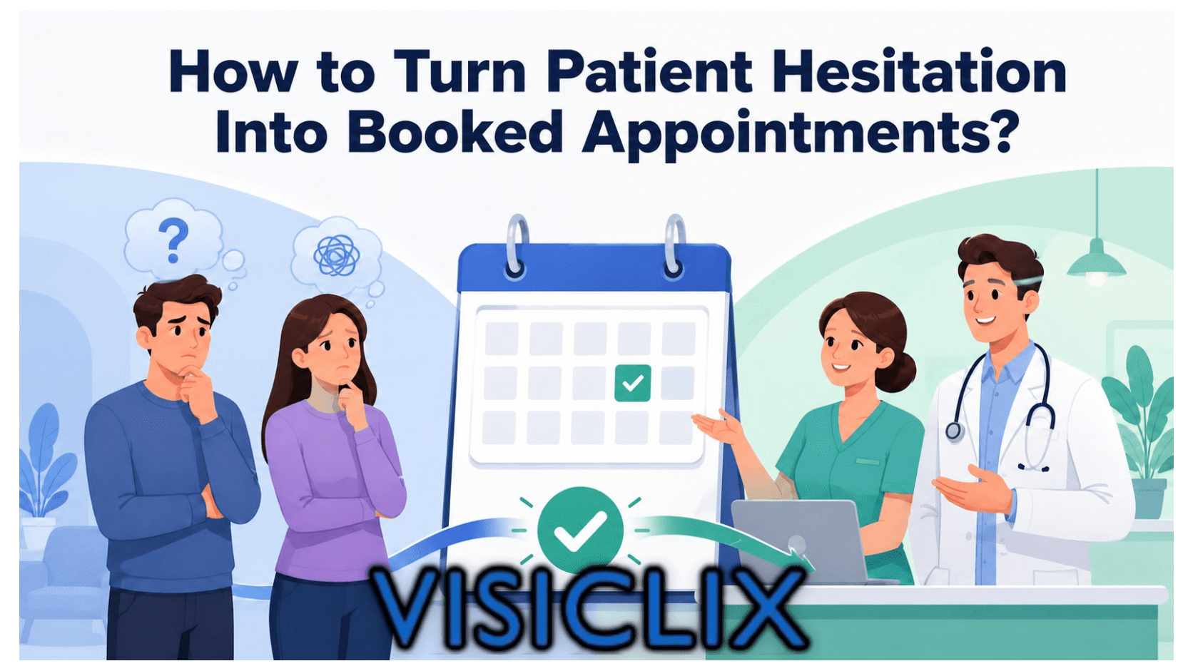
Medical website conversion optimization is the process of increasing the percentage of visitors who take a meaningful next step, such as booking an appointment, calling your office, completing a form, or verifying insurance. In healthcare, that job is harder than in many other industries because visitors are not just comparing features or prices. They are often worried, uncertain, and trying to decide whether they can trust you with something personal and important. Google’s guidance for search visibility also reinforces this reality by prioritizing helpful, reliable, people-first content, especially in sensitive categories like health.
That is why many healthcare websites do not really have a traffic problem first. They have a messaging problem. A page can rank, attract clicks, and still underperform because it does not reassure patients quickly enough, explain the next step clearly enough, or show enough proof that the practice is credible and easy to work with. Consumer research from Kyruus Health shows that 52% of consumers consult three or more online resources when searching for a provider, service, or care location, which means your website is often part of a broader evaluation process rather than the only stop.
If your site is getting visits but not enough booked appointments, the answer is usually not “change the button color.” More often, the better fix is improving what the page says, what it proves, and how confidently it guides the visitor forward. Below are five messaging fixes that can make a measurable difference.
What is medical website conversion optimization?
Medical website conversion optimization means improving your website so more visitors become patients, leads, or qualified inquiries. Depending on your practice, that conversion could be an online booking, a consultation request, a phone call, a referral inquiry, a patient portal step, or an insurance-related action. In practical terms, it is the work of reducing friction between interest and action.
The reason this matters so much in healthcare is simple: patient decisions are shaped by trust, clarity, and communication. AHRQ states that communication between patients, families, and clinicians is a critical component of high-quality, safe care, while CMS’s HCAHPS framework publicly measures patient perspectives on communication and care experience. That same trust-and-clarity dynamic starts long before a patient arrives in the office. It starts on the website.
There are also real performance benchmarks to justify optimization work. Unbounce’s healthcare and wellness benchmark data shows median conversion rates vary by subcategory, with healthcare around 5.1%, medical treatment around 5.3%, and dental around 4.3% in the examples it publishes. That tells you two things at once: first, conversion improvement is measurable; second, there is meaningful room between weak and strong pages.
Why do medical websites get traffic but fail to turn visitors into patients?
Most medical websites fail to convert because they do not answer the visitor’s biggest question fast enough: “Am I in the right place?” When a person lands on a service page, they are not looking only for information. They are also looking for reassurance that your practice understands their problem, treats patients like them, and offers a process that feels safe and manageable. If the page opens with bland, generic language, the visitor has to do the interpretive work themselves. Many leave before they ever reach your form or phone number.
Healthcare consumers are also increasingly digital, which raises the standard for the online experience. Kyruus Health’s 2024 benchmark report says 92% of consumers are interested in scheduling appointments online, and 35% would switch providers for the ability to book appointments online; among those who skipped care in the past year, 48% would switch providers for that ability. When expectations are this high, weak messaging does more than feel vague. It creates doubt at the exact moment patients want certainty.
Another problem is that many healthcare websites talk like brochures instead of decision tools. They describe the practice in broad terms, list services, and mention compassion or quality, but they do not make the patient’s next move feel obvious. People who are anxious, busy, or comparing multiple providers tend to respond better to pages that are specific, simple, and concrete. Google’s people-first guidance supports that same principle: content should exist to help people, not just fill space or target search terms.
How does messaging influence patient decisions more than many practices realize?
Messaging shapes whether a patient feels understood. That sounds soft, but it has hard business consequences. When your headline reflects the problem the visitor is trying to solve, when your body copy explains what to expect, and when your CTA describes a low-friction next step, you reduce cognitive load and hesitation. In healthcare, those small moments matter because the user may already be stressed, skeptical, or worried about making the wrong choice.
Trust is part of messaging too. It is not limited to credentials pages or review widgets. Trust is communicated through wording such as response expectations, process transparency, clear provider information, accepted insurance details, and privacy reassurance. HHS notes that HIPAA exists to protect the privacy and security of health information, and patients are well aware that health-related inquiries feel more sensitive than ordinary lead forms. Even simple wording that signals privacy and professionalism can help reduce form hesitation.
Good messaging also improves the usefulness of your analytics. Google Analytics 4 defines engagement rate around engaged sessions, which include visits lasting longer than 10 seconds, sessions with a key event, or visits with two or more page views. If your message is weak, users often fail to engage meaningfully at all. If your message is strong, downstream metrics such as key events, appointment clicks, and form completions become easier to interpret and improve.
What messaging fix #1 helps patients know they are in the right place?
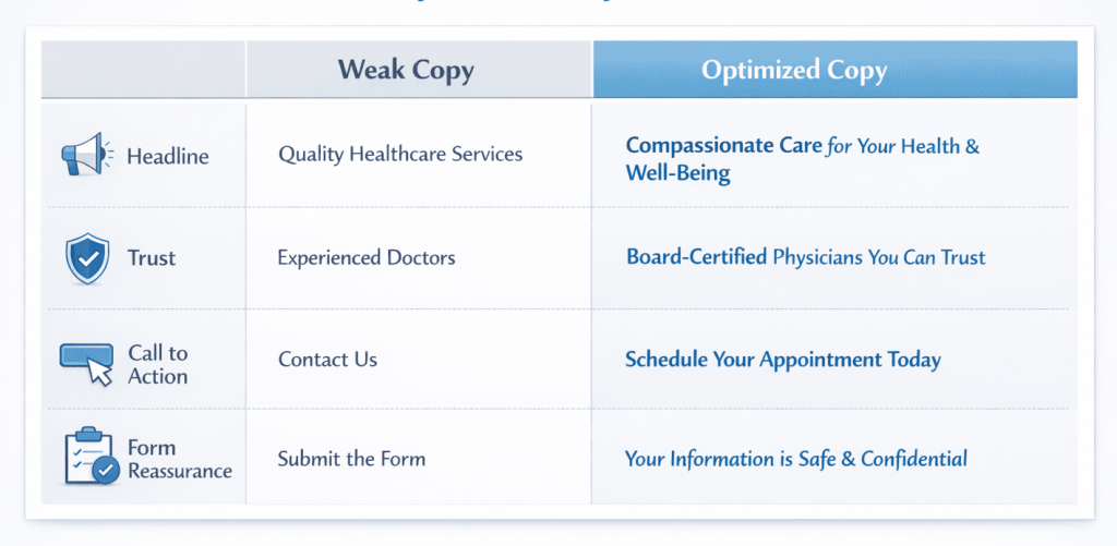
The first fix is to replace vague headlines with patient-centered clarity. Many healthcare websites lead with language like “Compassionate Care for Your Family” or “Welcome to Our Practice.” Those lines are not wrong, but they are too broad to do heavy lifting. A stronger headline identifies the patient problem, the service area, or the outcome in plain language. For example, “Need Relief From Chronic Back Pain? Explore Non-Surgical and Surgical Spine Care Options” gives the visitor much more to hold onto than a generic promise of quality.
A good above-the-fold section should usually accomplish three things in seconds: identify who the page is for, explain the benefit or next step, and reduce uncertainty. That can be done with a clear headline, a specific supporting sentence, and one action-oriented CTA. Because healthcare consumers often compare multiple sources before choosing a provider, precision helps your page stand out faster. Kyruus reports that more than half of consumers consult at least three online resources during provider search, so first impressions carry real weight.
This does not mean every headline has to sound salesy. It means it should sound useful. The best headlines reassure people that they found the page they were hoping to find. In conversion terms, that is message match. In plain terms, it is the difference between confusion and relief.
What messaging fix #2 builds trust before asking for the appointment?
The second fix is to place trust-building content before or beside the conversion ask, not after it. Too many pages ask visitors to schedule, submit, or call before the page has earned that action. In healthcare, trust is not optional. AHRQ emphasizes that communication is foundational to quality and partnership in care, and CMS publicly reports patient perspectives on communication because it is central to experience and decision-making. Your website should reflect that same priority.
Useful trust signals include physician credentials, years of experience, treated conditions, affiliations, recognizable review themes, accepted insurance information, response-time expectations, and photos that make the practice feel real. Kyruus also found that quality indicators matter during provider selection: 71% rated online patient ratings and reviews as extremely or very important, 76% said displayed quality scores or ratings were extremely or very important, and 51% said online appointment scheduling was extremely or very important.
This is where many practices underperform. They may have the credibility, but they hide it. They may mention board certification on an About page, insurance details on a buried FAQ, and reviews on a separate platform. Bringing those signals closer to the conversion path makes the page feel safer and more complete. The goal is not to overwhelm the visitor. The goal is to remove the silent reasons they might hesitate.
What messaging fix #3 makes calls to action easier to say yes to?
The third fix is to make your CTA describe the next step, not just demand action. “Submit” is weak because it tells the visitor what to do, but not what happens next. “Book Now” can work in the right context, but it can also feel too final for people who are still evaluating. In healthcare, lower-friction CTAs often perform better because they align with uncertainty. Phrases like “Request an Appointment,” “Check Availability,” “Verify Insurance,” or “Speak With Our Team” feel more human and more informative.
This matters even more because online scheduling is no longer a nice extra. Kyruus reports that 92% of consumers are interested in scheduling appointments online, and its report frames online scheduling as high-demand with persistent barriers. When a user is ready to act, vague CTA language adds unnecessary friction. Clear CTA language reduces that friction by signaling what comes next.
The best CTA also matches the page’s intent. A high-intent landing page for a known procedure may justify “Request an Appointment.” A top-of-funnel page for a complicated treatment may convert better with “Talk to a Specialist” or “Ask About Treatment Options.” The more uncertain the patient is, the more your CTA should feel like guidance rather than pressure.
What messaging fix #4 helps service pages convert instead of just inform?
The fourth fix is to write service pages around patient decisions, not just provider descriptions. Many medical service pages explain what the practice offers but skip the parts that help patients decide whether to move forward. A better structure is built around questions patients are already asking: Who is this for? What symptoms or problems does it address? What outcomes are realistic? What is the process like? Why should I trust this team? What should I do next?
This kind of structure is not just better for users. It is also more aligned with what Google says it wants to reward: content that is created to benefit people and demonstrate expertise. On healthcare pages, that usually means being clear, specific, and helpful without exaggerating outcomes or hiding essential context.
A high-converting service page often begins with a direct answer, expands with useful explanation, adds credibility, and then offers a clear next step. In other words, it behaves less like a static brochure and more like a guided consultation. That is especially important because patient experience and communication are core quality themes across healthcare research and reporting, from AHRQ’s communication guidance to CMS’s patient experience framework.
What messaging fix #5 reduces anxiety at the moment of conversion?
The fifth fix is to add reassuring microcopy around forms, phone numbers, and scheduling tools. This is one of the easiest improvements to implement and one of the most overlooked. Patients often hesitate because they do not know how long the form will take, when they will hear back, whether insurance questions are welcome, or how their information will be handled. A short line of copy can answer those concerns before they turn into abandonment.
Helpful examples include “Takes less than a minute,” “A team member will contact you within one business day,” “Prefer to call instead? Use the number below,” and “Your information is handled securely.” HHS’s HIPAA resources reinforce how important privacy and security are in health contexts, so even simple reassurance can improve confidence.
Kyruus also notes that consumers want user-friendly self-service options and that improving digital tools can reduce burden on staff while better meeting consumer expectations. That supports a broader CRO principle: the clearer and easier the next step feels, the more likely people are to complete it.
How can you tell whether your medical website messaging is hurting conversions?
A messaging problem usually shows up before you can name it. You might have steady traffic but very few booked appointments. Your service pages may rank but generate weak lead volume. Visitors may click into the site and leave without triggering meaningful engagement. In GA4 terms, you may see poor engagement rates, weak key-event rates, or a high percentage of sessions that do not qualify as engaged sessions. Google defines engaged sessions as visits that last longer than 10 seconds, have a key event, or include at least two page or screen views.
You can also spot messaging issues operationally. If your staff regularly gets calls asking questions that your site should have answered, that is a signal. If patients ask whether you accept their insurance, whether you treat a certain condition, or whether they can schedule online, your website may be failing to provide confidence at the point where it matters. Kyruus’s data shows those practical details are important to provider selection and digital access.
A useful test is to look at your highest-intent pages and ask three questions. Does the page identify the patient problem quickly? Does it prove credibility before the CTA? Does it make the next step feel clear and low-risk? If the answer to any of those is no, you likely have conversion headroom.
How do you improve medical website conversion optimization without a full redesign?
You do not need a full redesign to improve conversion performance. In many cases, the fastest wins come from rewriting above-the-fold copy, improving service-page structure, strengthening trust placement, and clarifying CTAs. That is good news for practices that already have traffic but do not want to pause operations for a long rebuild.
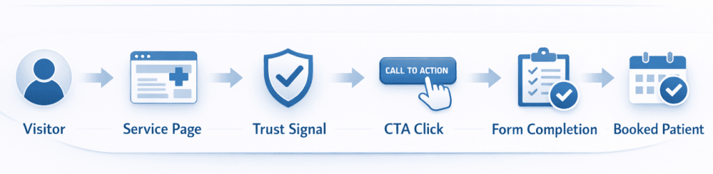
A practical sequence is to start with one high-intent page, usually a core service page or paid landing page. Rewrite the headline and subhead so they sound patient-centered and specific. Add trust signals near the primary CTA. Reduce the number of choices if the page feels cluttered. Improve form microcopy. Then measure the result using conversion events, engagement rate, and assisted actions in GA4. Google’s own documentation makes those engagement and key-event definitions clear enough to support disciplined testing.
This approach works because optimization is rarely one dramatic move. It is usually a series of smaller decisions that reduce hesitation. In healthcare, that means making the site more understandable, more credible, and easier to act on.
FAQ
What is a good conversion rate for a medical website?
It depends on the channel, page type, and specialty, but healthcare conversion benchmarks published by Unbounce show a median healthcare industry conversion rate around 5.1%, with medical treatment around 5.3% and dental around 4.3% in its reported subcategories. The better question is whether your high-intent pages are improving over time and whether they convert traffic into meaningful patient actions.
Can better copy improve patient bookings without redesigning the site?
Yes. Better copy can improve message match, clarity, trust, and CTA performance without changing the whole design. Since engagement and conversion behavior in GA4 depend on meaningful user interaction, stronger messaging can improve both user understanding and measurable performance.
What should a healthcare homepage say above the fold?
It should tell visitors who you help, what problem or need you address, and what they should do next. Generic branding language is less useful than a specific statement tied to patient needs and a clear CTA. That approach also aligns with Google’s people-first content guidance.
Why do patients abandon appointment forms?
Patients often abandon forms because they do not know how long the process takes, what happens after submission, whether the practice accepts their insurance, or how their information will be handled. In health contexts, privacy and trust concerns can be especially strong, which is why reassurance copy and clear expectations matter.
What trust signals matter most on medical websites?
Credentials, provider expertise, ratings and reviews, accepted insurance, process transparency, and privacy reassurance are among the most useful. Kyruus found that ratings and reviews, displayed quality scores, and online scheduling availability are all important to many consumers when selecting care.
How many calls to action should a medical landing page have?
There is no universal number, but the page should have one primary CTA that matches the visitor’s intent and does not compete with too many equal-priority options. The main goal is clarity, not volume. When the next step is obvious, hesitation usually drops.
Conclusion
If your website is not turning enough visitors into patients, the issue may not be your traffic source at all. It may be that the page does not confirm relevance quickly, build trust early, explain the next step clearly, or reduce anxiety at the moment of action. In healthcare, those are not cosmetic details. They are decision drivers. Research from AHRQ, CMS, Kyruus, HHS, and Google all points in the same direction: people respond better when care experiences are clear, trustworthy, and easy to navigate.
The strongest medical website conversion optimization strategies are usually simple at the core. Say the right thing sooner. Prove credibility earlier. Ask for the next step more clearly. Make the experience feel easier and safer. That is how more visits become more patient conversations, and more patient conversations become more appointments.
Why Visiclix is Your Ideal Choice for Medical Website Conversion Optimization?
Visiclix is built for the gap that holds many healthcare websites back: the space between traffic and trust. A lot of agencies can drive clicks. Far fewer know how to turn those clicks into patient actions with messaging that feels credible, compliant-aware, and conversion-focused. That is where Visiclix stands out. By aligning search intent, page structure, trust signals, and CTA language, Visiclix helps healthcare organizations make better use of the traffic they already earn.
Just as important, Visiclix understands that healthcare conversion work is not generic ecommerce CRO. Patients have different fears, different expectations, and different reasons for delaying action. The website has to respect that reality. Visiclix approaches medical website conversion optimization with a patient-centered lens, helping practices clarify what they do, whom they help, and why the next step is worth taking now. The result is a website that feels less like a brochure and more like a confident extension of the patient experience.
Ready to Turn More Website Visitors Into Patients With Visiclix?
If your practice is getting traffic but not enough appointments, form submissions, or calls, it may be time to fix the message before rebuilding the whole site. Visiclix can help you identify where patients are hesitating, rewrite the pages that matter most, and create a clearer path from visit to conversion.