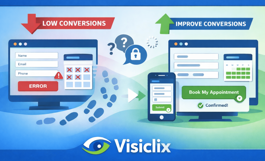
If you’re driving people to your site—especially through PPC—your appointment form isn’t just a form. It’s the moment revenue either happens… or quietly slips away.
A low appointment form conversion rate doesn’t always mean visitors aren’t interested. More often, it means the booking experience is asking for too much effort, too much trust, or too much patience. The good news is that appointment forms are one of the most “fixable” parts of a site: small changes to clarity, speed, and flow can lift conversions without changing your traffic at all.
This guide walks through the core problems that hold appointment forms back, what to measure before changing anything, and the CRO improvements that tend to deliver the biggest lift—without turning the whole article into a checklist.
What is an appointment form conversion rate, and what counts as a conversion?
Your appointment form conversion rate is the percentage of visitors who complete the booking action you care about.
That “conversion” usually means one of two things:
- A confirmed appointment (best case): the visitor selects a time and reaches a confirmation state.
- A request submitted: the visitor sends a booking request and expects you to follow up to schedule.
Both can be valid—what matters is consistency in measurement and clarity in your business goal. If your reporting counts “requests submitted” as success, but your real goal is “confirmed bookings,” you might think CRO is working while your calendar stays empty.
A straightforward way to calculate it is:
Appointment form conversion rate = (Completed bookings or requests ÷ Form views) × 100
The real CRO work starts when you track not just the end result, but where users struggle on the way there.
What’s a good appointment form conversion rate, and why benchmarks can mislead?
It’s tempting to chase a universal benchmark, but appointment forms don’t behave like standard lead-gen forms. A calendar-based booking flow is inherently different from a simple “contact us” submission.
It’s also common to see “appointment conversion” used in a different context: appointment setting (outreach teams turning leads into meetings) versus appointment forms (website users booking). Those numbers aren’t interchangeable, even if the term sounds similar. Some benchmark discussions fall into the outreach category, which can be helpful context—but it’s not a direct comparison for on-site form performance. (Competitor example: Intelemark’s angle leans more into appointment setting context.)
A more practical standard is to measure “good” relative to your own funnel health:
- Are visitors starting the form after they see it?
- Are they abandoning at a specific field or step?
- Are mobile users dropping at much higher rates than desktop?
- Are you tracking confirmed bookings reliably, or just submits?
When those become visible, improvement stops being guesswork.
Why do appointment forms underperform—even when traffic quality is high?
Most appointment forms lose conversions for the same few reasons, and you can usually spot them in user behavior within minutes:
Friction shows up when the form feels like work. Too many fields, too much typing, unclear required inputs—especially on mobile.
Uncertainty appears when users don’t know what happens after they submit. Will they get a call immediately? Is the appointment confirmed? Are they consenting to marketing follow-ups?
Scheduling resistance happens when picking a time feels painful: too many clicks, unclear availability, time zone confusion, or a calendar that loads slowly.
Technical issues can be the silent killer. A form can “look fine” but still lose bookings through sluggish widget performance, validation bugs, or broken confirmation flows.
These issues aren’t exclusive to any one industry. Even competitor content aimed at providers emphasizes the same fundamentals: reduce friction, build trust, and test systematically rather than relying on opinions.
What should you measure before you change your appointment form?
Before you redesign anything, you want to know where your form is leaking.
The simplest useful view is a funnel:
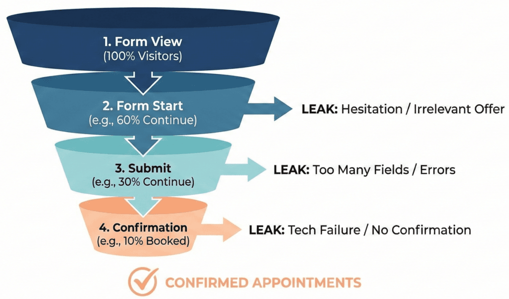
Form view → Form start → Submit → Confirmation
That last step—confirmation—matters more than most teams realize. If a user submits but never reaches a reliable confirmation state, you’ll both lose real bookings and misread performance.
Beyond that, the most valuable diagnostic signals are:
- Step completion rate (if your form is multi-step)
- Time-to-complete (long times often signal confusion or friction)
- Error frequency (which fields trigger the most failures)
- Mobile vs desktop split (mobile usually reveals the biggest UX issues)
- Speed and load behavior (especially if you use embedded booking widgets)
Once you have these, you can prioritize changes that remove the biggest blockers first—rather than tweaking aesthetics and hoping.
How do you improve appointment form conversion rate without turning your site into a redesign project?
Most successful appointment form CRO follows a simple theme: make booking feel safe, fast, and inevitable.
Instead of treating optimization as “seven separate fixes,” think of it as improving three experiences:
- the commitment moment (do I want to start this?)
- the completion experience (can I finish easily?)
- the confirmation moment (did it work, and what happens next?)
The improvements below map to those three moments.
How do you reduce friction without losing lead quality?
The fastest lift usually comes from reducing what you ask for upfront.
A booking form should collect only what’s necessary to schedule. Anything else—even if it’s “nice to have”—reduces completion, especially for paid clicks where users are impatient.
If you’re currently collecting details like budget, full address, long descriptions, or multiple preference fields, try a different approach:
- Use progressive disclosure: ask one or two light qualifiers first, then reveal more only if needed.
- Collect extra information after booking: on the confirmation page, via a short intake form, or through a follow-up email/SMS.
You don’t lose quality by delaying non-essential questions—you often improve it. People are far more willing to share details once they feel the appointment is real.
How do you make the first screen of the form feel worth finishing?
Users decide whether to proceed almost instantly. The first screen should remove uncertainty and make the value obvious.
A strong first screen usually communicates:
- What they’re booking (and the duration)
- What happens after they book (instant confirmation vs follow-up)
- How soon they’ll hear from you
- What they are (and aren’t) agreeing to (e.g., “No obligation” / “No spam”)
One of the most overlooked changes here is CTA wording. “Submit” is vague and transactional. Outcome-based CTAs feel safer and clearer because they match the user’s intent.
Better examples:
- “See available times”
- “Book my appointment”
- “Get confirmation”
This isn’t just polish—it changes perceived effort and perceived risk.
How do you make mobile completion feel effortless?
Mobile users abandon forms for reasons desktop users never encounter: keyboards hiding buttons, tiny inputs, excessive scrolling, and fields that could have been autofilled but weren’t.
If your appointment form conversion rate is dramatically lower on mobile, it’s often a sign of friction you can fix quickly:
- Ensure fields use the right input types so phones show the correct keyboard.
- Use autofill wherever possible.
- Increase spacing so users don’t mis-tap.
- Prevent keyboard overlap from blocking your primary CTA.
Mobile UX improvements don’t just increase conversion rate; they reduce “garbage submissions” from frustrated users who rush or quit halfway through.
How do you build trust right where hesitation happens?
Trust signals are most effective near the point of commitment, not buried in a footer.
If a visitor is about to book and sees “tell us your phone number,” their internal question becomes: Why do you need this? What will you do with it?
Small pieces of reassurance resolve that doubt:
- A short privacy note near the button (“Used only to confirm your appointment”)
- A credible testimonial snippet relevant to the service
- Ratings or review count (if real and current)
- Clear expectation-setting (“We’ll confirm within 1 business hour”)
Competitor guidance aimed at providers often emphasizes trust-building for forms because the same dynamic appears across industries: people don’t abandon because they dislike the offer—they abandon because they’re uncertain about the follow-up.
How do you prevent errors from killing the booking attempt?
Validation should help users complete the form—not punish them for trying.
The most conversion-killing pattern is the “red wall”: users hit submit, the form lights up with multiple errors, and they feel like they failed. That’s when abandonment spikes.
Better patterns are subtle and supportive:
- Validate in a way that feels timely (not prematurely yelling at users while they’re typing).
- Make formatting requirements obvious upfront (examples help).
- Preserve data if an error occurs—don’t wipe fields and force re-entry.
- Keep error messages human and specific (“Please enter a 10-digit phone number”) instead of generic (“Invalid input”).
This is one of those fixes that doesn’t just boost conversion rate—it improves brand perception.
How do you remove scheduling friction that quietly blocks bookings?
If your form includes scheduling, treat “picking a time” as the main event. A surprising number of booking flows bury availability until the end, forcing people to type first, then discover there are no good time slots.
You can reduce scheduling abandonment by:
- Showing availability earlier (or setting expectations clearly if you can’t).
- Defaulting to “next available” instead of forcing lots of clicking.
- Making duration, time zone, and appointment format explicit.
- Making rescheduling feel easy (it increases willingness to book now).
When scheduling feels simple, people commit faster—and cancellations drop because expectations are clearer.
How do you fix the silent conversion leaks: speed, reliability, and tracking?
Some appointment forms look good but still underperform because the underlying experience is unreliable.
Common issues include:
- booking widgets that load slowly or inconsistently,
- submissions that succeed but don’t trigger a confirmation state,
- tracking that counts “button clicks” but misses real submits or confirmations.
If you’re spending on PPC, this matters because inaccurate tracking causes you to optimize campaigns based on the wrong signals. You want to know the difference between:
- a form that was started,
- a form that was submitted,
- a booking that was confirmed.
When tracking is clean and confirmations are reliable, optimization becomes compounding: every improvement actually shows up in your data and your ad algorithms.
What should you test first for the fastest lift?
If you want the quickest improvement in appointment form conversion rate, prioritize changes that reduce effort and uncertainty:
Start with field reduction and clarity on what happens next. Then fix mobile friction and error handling. After that, streamline scheduling and improve performance.
This order works because it targets the biggest blockers first—the ones that prevent motivated visitors from completing the booking.
FAQ
What’s the fastest way to improve appointment form conversion rate without redesigning the whole page?
Cut unnecessary fields, clarify what happens after submission, and remove mobile typing friction. Those changes reduce abandonment quickly because they lower effort and uncertainty.
Should an appointment form be single-step or multi-step?
Single-step works best when the form is truly short. Multi-step works better when you have multiple inputs or scheduling—provided each step feels small and the user sees progress.
How many fields should an appointment booking form have?
As few as possible to schedule. If a field isn’t required to confirm or route the appointment, collect it after booking.
What’s the best CTA text for an appointment form?
Use outcome-based CTAs: “Book my appointment,” “See available times,” or “Get confirmation.”
Why is my appointment form conversion rate much lower on mobile?
Mobile exposes friction: keyboards, scrolling, tiny touch targets, slow widgets, and fields that don’t autofill properly.
How do I track appointment form drop-off correctly for PPC?
Track form views, starts, submits, and confirmations separately. You should be able to tell the difference between “someone clicked submit” and “a booking was actually confirmed.”
Conclusion
An appointment form doesn’t fail because people don’t want the service. It fails when booking feels uncertain, slow, or unnecessarily difficult.
If you focus on the moments that matter—getting users to start, making it easy to finish, and giving them a clean confirmation—you can lift your appointment form conversion rate without buying more traffic. For PPC especially, those gains are the difference between “we’re paying for leads” and “we’re filling the calendar.”
Why Visiclix is Your Ideal Choice for Appointment Form CRO?
Visiclix improves appointment form performance by treating it as a revenue system, not a design debate. The process starts with diagnosis—where users drop, what triggers hesitation, which fields cause errors, and how mobile behavior differs—so your changes are driven by evidence, not assumptions.
More importantly, Visiclix ties CRO to outcomes that matter: confirmed bookings, lead quality, and accurate measurement for PPC optimization. When tracking is clean and the booking flow is frictionless, every improvement becomes measurable—and those gains compound over time instead of stalling after “quick wins.”
Get Visiclix to Fix Your Appointment Form Conversion Rate
If you want more booked appointments from the traffic you already have, Visiclix can identify the biggest drop-off points in your booking flow and implement the highest-impact CRO improvements.
Request an Appointment Form CRO Audit with Visiclix and start turning more visits into confirmed appointments.