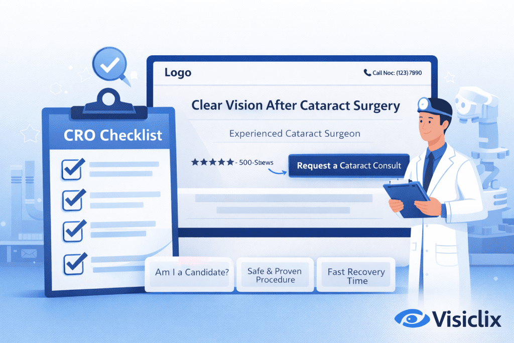
If you’re paying for traffic (or trying to rank organically), a cataract surgery landing page should do one job: convert the right visitor into a consult request—quickly, confidently, and measurably. That means ruthless focus: tight message match, fast mobile UX, credible proof, low-friction conversion paths, and tracking that tells you which clicks become real appointments.
Below is a practical, build-or-audit checklist you can use section by section.
What is a cataract surgery landing page, and how is it different from a regular website page?
A cataract surgery landing page is a single-purpose page designed to convert visitors from a specific channel (most commonly PPC) into one primary action—usually a consult request or call.
How it differs from a typical service page:
- One goal, one next step. Regular pages often try to educate, navigate, and cross-sell. A landing page prioritizes conversion above everything else.
- Stronger “expectation match.” Google evaluates whether the page meets the expectations set by the ad and whether it’s easy to navigate and useful.
- Built for measurement. Landing pages are structured so every CTA, form, and call can be tracked as a conversion event.
What is the one conversion goal your cataract landing page should optimize for?
Pick one primary conversion and design the entire page around it:
- Request a consult (form submission) if your front desk qualifies leads and books.
- Call now if phone converts better and you have consistent coverage.
- Schedule online if you have a true scheduling workflow and it reduces friction.
Then define micro-conversions only if they support the primary goal (e.g., “start form,” “click-to-call,” “open map”)—but don’t split attention with competing CTAs.
What must be visible above the fold to earn trust in under 5 seconds?
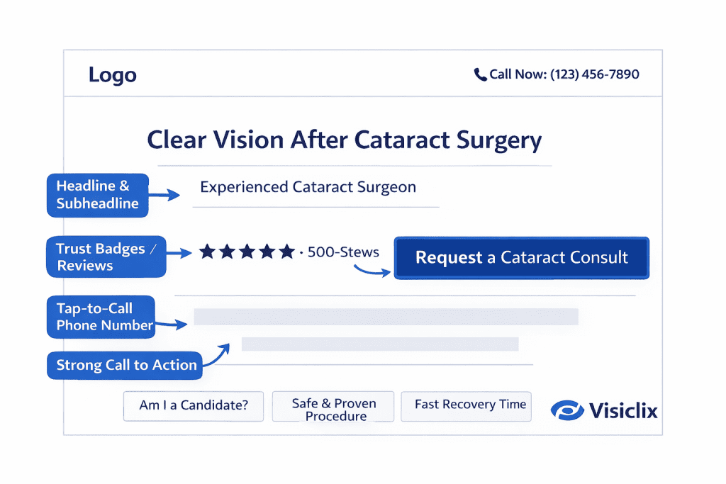
Above the fold should answer three silent questions: Is this for me? Can I trust you? What do I do next?
Above-the-fold checklist
- Headline that matches the ad promise. If your ad says “cataract consult,” the headline should say the same thing—plainly.
- One credibility line. Examples: surgeon experience, specialist focus, or clinic volume—kept short and factual.
- Primary CTA button (and repeated again soon after). Use specific language like “Request a Cataract Consult.”
- Tap-to-call phone number on mobile and make it visually secondary if the form is your primary conversion.
- One proof element (e.g., star rating + review count, awards, affiliations) placed near the headline or CTA.
CRO tip: keep navigation minimal. Extra links can dilute attention and raise bounce.
How do you create “message match” between your ads and the landing page?
Message match is the fastest way to improve both conversion rate and lead quality—and it’s part of what Google considers in landing page experience.
Message match checklist
- Repeat the core offer verbatim from ad → headline → first CTA (same language).
- Align to the exact intent (consult, lens options discussion, premium lens interest, etc.).
- Use campaign-specific sections when intent differs (e.g., one ad group is “recovery time,” another is “premium lenses”). A single generic page usually underperforms.
What content answers the top patient fears without turning the page into an encyclopedia?
A landing page should feel reassuring, not overwhelming. Aim for “just enough clarity” to earn a consult.
High-converting reassurance blocks
- What to expect (in plain language): what happens at the consult + what the procedure generally involves.
- Recovery expectations: simple milestones and what patients commonly ask (no dramatic claims).
- Candidate cues: 4–6 bullets that help visitors self-identify (age, symptoms, daily-life impact).
Keep this content scannable and positioned after the first CTA—so ready-to-convert visitors can act immediately.
What trust signals matter most for cataract—and where should they go on the page?
Trust isn’t one section—it’s distributed proof.
Trust signal checklist
- Near the hero: review rating/review count or a recognizable credential/affiliation (one, not five).
- Mid-page: surgeon credentials, clinical focus, and an “our approach” block (short paragraphs).
- Near the form: a reminder of what happens next and how fast patients can expect a response.
Avoid proof overload. A few strong signals beat a cluttered wall of logos.
How should you present lens options (including premium IOLs) without confusing visitors?
Your job is to create clarity—not teach ophthalmology.
Lens options checklist
- Present options as outcomes and lifestyle benefits (distance/near, night driving, astigmatism correction) rather than product names.
- Use a simple “options overview” (3 columns max) with a note: final recommendations happen during the consult.
- Add a small FAQ-style block: “Will I need glasses after?” / “What if I have astigmatism?”—then point to the consult.
What’s the best-performing lead form structure for cataract consult requests?
Forms convert when they feel easy and safe.
Form checklist
- Keep fields minimal: name, phone, email, preferred contact method, and one qualifying question (optional).
- Clear labels and visible instructions. Accessibility guidance emphasizes proper labels and programmatic relationships for form controls.
- Helpful error handling. If something is wrong, the page should clearly identify the error and how to fix it.
- Privacy reassurance near the submit button: short, human language plus links to policy pages.
Multi-step forms: often work when you want a low-commitment first step (e.g., “Check eligibility”), but don’t add steps unless you can measure completion drop-off.
Which CTA patterns work best for cataract surgery landing pages?
CTA checklist
- Primary CTA appears multiple times (hero, mid-page, near proof, near bottom).
- Mobile sticky CTA (button or call) if your audience skews mobile.
- One action per button. Don’t mix “Call / Schedule / Form” equally—choose a primary.
Button copy should be specific and low-anxiety:
- “Request a Cataract Consult”
- “Talk to Our Care Team”
- “Check Availability”
How do you handle pricing, insurance, and financing questions without killing conversions?
Many visitors won’t convert if they’re embarrassed to ask about cost. You can acknowledge the concern without guessing.
Pricing/coverage checklist
- Add a short block: what influences cost (lens choice, coverage, clinical factors) and what the consult clarifies.
- If you accept insurance, say so clearly.
- If you offer financing, keep it simple and avoid making it the headline unless your campaigns are price-driven.
What design and UX checks prevent wasted ad spend (especially on mobile)?
Speed and usability are not “nice to have.” Core Web Vitals reflect real-user experience signals (LCP, INP, CLS), and Google provides guidance on understanding and monitoring them.
UX checklist
- Fast hero load (optimize images, avoid heavy sliders).
- No layout jumps as the page loads (CLS control).
- Tap targets and form fields sized for thumbs.
- Remove friction links (full nav, unrelated services, blog rabbit holes) unless they directly support trust.
What compliance and privacy elements should a cataract landing page include?
Compliance checklist
- Avoid absolute guarantees (“no risk,” “perfect vision,” “painless,” etc.).
- Don’t request unnecessary sensitive information in the form.
- Include privacy policy and basic consent language for calls/texts (especially if you follow up by SMS).
- Maintain accessible forms and error messaging (good for both compliance posture and conversions).
How do you set up conversion tracking so you can optimize for profit, not just leads?
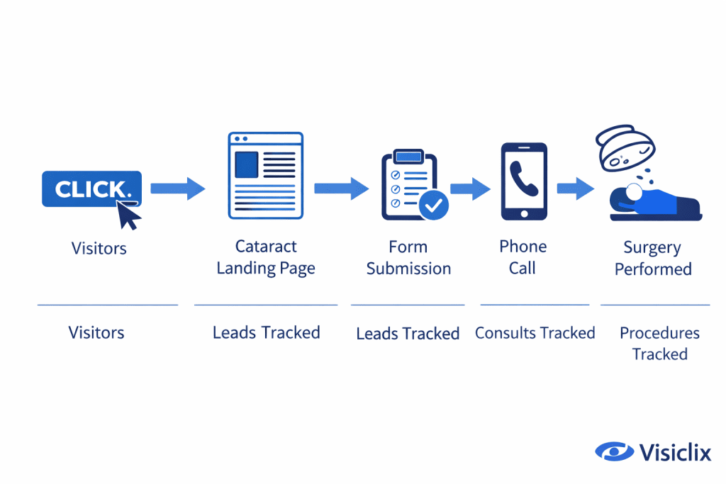
If you can’t measure, you can’t optimize. Google’s shows that you define what counts as a conversion (forms, calls, etc.) and then set up measurement accordingly.
Tracking checklist
- Track form submits as conversions.
- Track calls from the website using website call conversion tracking so you can count meaningful calls (and filter out very short ones).
- Track booked consults (offline conversion/import if possible) so campaigns optimize for real appointments—not just leads.
Which A/B tests usually move conversion rate fastest for cataract pages?
Start with the leverage points closest to conversion:
High-impact test ideas
- Headline clarity vs benefit-led headline (keep message match intact).
- Proof near the hero (rating vs credential vs “what happens next”).
- CTA copy (specific consult language usually beats generic “Submit”).
- Form length (remove one field at a time).
- Mobile sticky CTA vs no sticky CTA.
FAQ
Should I use one cataract surgery landing page or multiple pages for different audiences?
Multiple pages usually win when your ad groups target different intents (cost vs recovery vs premium lenses). One page can work if your messaging is narrow and consistent.
Is it better to push calls or form fills for cataract consults?
Calls can convert faster, but forms often deliver better tracking and qualification. Many practices do best with one primary (form) and one secondary (call).
How long should a cataract landing page be?
Long enough to earn trust and answer key fears—short enough to stay scannable. Most high performers use multiple short sections with repeated CTAs.
Can a cataract landing page rank in SEO, or is it only for ads?
It can rank, but pure “ad-style” pages often underperform in SEO unless they also satisfy informational intent. If SEO is a goal, ensure the page is genuinely helpful and fast.
What’s the biggest reason cataract landing pages fail to convert?
Mismatch: the ad promise doesn’t match the page, the page doesn’t feel trustworthy, or the conversion path has friction (slow load, confusing form, weak CTA).
Conclusion
A strong cataract surgery landing page isn’t about fancy design—it’s about trust, clarity, and measurable conversion paths. Nail the above-the-fold essentials, maintain tight message match, remove mobile friction, and track forms and calls properly so you can optimize toward booked consults, not just “leads.”
Why Visiclix is Your Ideal Choice for Cataract Landing Page CRO?
Visiclix builds landing pages the way performance marketers think: starting with intent, message match, and a single conversion goal—then layering in trust signals and friction-reducing UX that helps the right patients take action. That means your page isn’t just “pretty,” it’s built to produce measurable outcomes you can tie back to campaigns.
Just as importantly, Visiclix treats tracking and lead quality as part of the landing page—never an afterthought. When form submits and calls are configured as real conversions, you can optimize for what actually matters: consult volume, show rate, and ultimately patient acquisition efficiency.
Book a Cataract Landing Page Audit with Visiclix
If you want a clear, prioritized list of changes that will lift conversion rate and improve lead quality, Visiclix can audit your current cataract surgery landing page and map fixes to impact (and testing order). Bring your current page URL and your top campaigns—we’ll focus on what moves results fastest.